
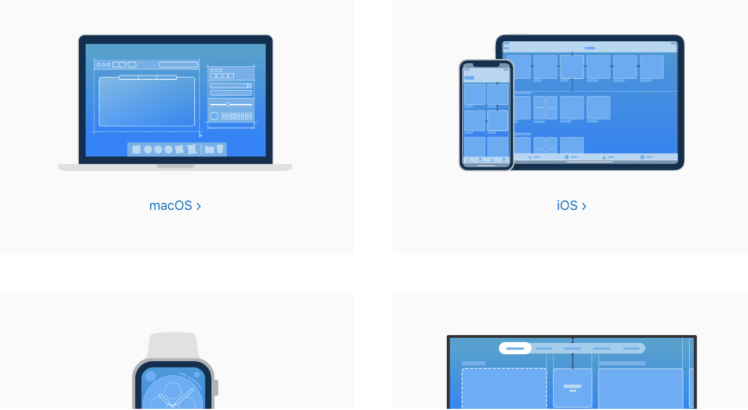
Web android and IOS design practices
Designing a website and its Android and iOS apps involves considering various aspects of user experience, functionality, and visual aesthetics. While there is no definitive "best" way to design, following some best practices can help create effective and user-friendly digital experiences. Here are some key considerations for each platform:
Website Design:
Responsive design: Ensure your website is responsive, meaning it adapts and displays properly across different devices and screen sizes, from desktops to smartphones and tablets. This provides a consistent experience for users regardless of the device they use.
User-centric approach: Focus on user needs and goals when designing the website. Create intuitive navigation, clear calls to action, and organized content to facilitate easy and efficient browsing. Conduct user research and usability testing to gather insights and refine the design.
Visual hierarchy: Establish a clear visual hierarchy to guide users' attention and help them navigate through the website. Use contrasting colors, typography, and spacing to differentiate between different sections and prioritize important information.
Consistent branding: Maintain consistent branding elements, such as logos, colors, typography, and visual styles, across the website. This helps establish brand identity and creates a cohesive experience for users.
Performance optimization: Optimize website performance by minimizing file sizes, compressing images, and leveraging caching techniques. Fast-loading pages contribute to a positive user experience and help with search engine optimization (SEO).
Android and iOS App Design:
Platform-specific guidelines: Familiarize yourself with the design guidelines and best practices provided by Google for Android and Apple for iOS. These guidelines provide recommendations on layout, navigation, interaction patterns, and visual styles specific to each platform.
Navigation and flow: Design clear and intuitive navigation within the app to help users move between screens and access different features. Follow platform conventions for navigation patterns, such as bottom navigation for Android or tab bars for iOS.
Responsive layouts: Similar to responsive web design, ensure your app's layout adapts well to different screen sizes and orientations. Accommodate various screen resolutions and aspect ratios to provide a consistent experience across devices.
Touch-friendly interface: Optimize the app's user interface for touch interactions, considering factors such as button size, spacing, and gestures. Make sure interactive elements are easily tappable and provide visual feedback upon user interaction.
Simplified user input: Minimize user input and simplify form-filling processes whenever possible. Utilize autofill features, input validation, and contextual keyboards to enhance user convenience and reduce errors.
Platform-specific design elements: Leverage platform-specific design elements and components to create a native look and feel. For example, Android apps can use Material Design components, while iOS apps can incorporate iOS Human Interface Guidelines elements.
Performance and optimization: Optimize app performance by reducing unnecessary animations, optimizing memory usage, and implementing efficient data retrieval and storage mechanisms. Smooth performance and responsiveness contribute to a positive user experience.
Accessibility considerations: Ensure your app is accessible to users with disabilities by following accessibility guidelines. Provide alternative text for images, support dynamic font sizes, and consider color contrast for readability.
Remember to gather user feedback and conduct usability testing throughout the design process to validate the effectiveness of your website and app designs. Iteratively refine the designs based on user insights and evolving user needs.